ONE OK ROCK [Jinsei×Kimi=] Event Design
ONE OK ROCK [ Jinsei×Kimi= ] LiveTourのデザイン
ONE OK ROCKのライブツアー「Jinsei×Kimi=」のロゴ、イラスト、グッズデザインを担当いたしました。本プロジェクトは、バンドの音楽性と情熱を視覚的に表現し、観客とステージが一体となる瞬間をデザインいたしました。
ツアーのテーマとビジュアルコンセプト
「Jinsei×Kimi=」というツアータイトルは、CDアルバムのタイトル「人生×僕=」から来ており、「人生×君=」のライブタイトルです。
アーティストとファンの融合するステージの情景が、その答えであると捉えました。ONE OK ROCKの音楽は、聴く者の心に深く響き、個々の人生に新たな意味を与えます。このツアーでは、ステージと観客が共鳴し、感情が爆発する瞬間、そのハードな部分を最大化することを目指しました。
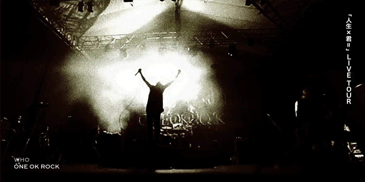
ビジュアルの中心に据えたのは、「魔導士」という象徴的な存在です。 魔導士は、音と言葉、ステージと観客、現実と幻想を結びつける神秘的な媒介者として構想し、ライブは、日常から解き放たれ、特別な世界に飛び込む儀式のような時間です。魔導士は、この没入体験の案内人であり、ツアーの世界観を束ねる存在としてデザインしました。魔導士のイラストは、力強さと繊細さを融合したタッチで描きました。具体的には、風をまとうローブに身を包み、両手を広げて光を放つ姿をイメージしました。この光は、バンドの音楽と観客の融合させ交錯させる様子を表しています。ライブ会場がひとつの魔法であるかのような幻想性を加えました。色彩は、黒と白を基調にし、モノトーンのコントラストで力強さと洗練された印象を強調しました。この配色は、バンドの情熱とクールな魅力を視覚的に体現するものです。
男性ファンと意志の表現
男性を意識したデザインの要望:ONE OK ROCKのファン層には女性が多い一方で、今回は特に男性に向けたデザインが求められました。男性ファンの力強さや情熱に応えるため、鋭角的で骨太なロゴを採用し、男性的な力強さと洗練された雰囲気を両立させました。
ハードインパクトロゴは、ライブのダイナミックなエネルギーを一瞬で伝える必要があります。そのため、太めのストロークと黒白の強いコントラストを採用し、視覚的なインパクトを最大化しました。
明朝と手書きの融合個性を際立たせるため、明朝体の端正さと手書きの自由さを組み合わせた独自の書体を開発しました。明朝の直線的な美しさは、ツアーのテーマである「意志」を表現し、手書きのラフなタッチは、バンドの人間らしい温かみを加えました。
過去最大の売り上げと世界的な展開
ツアーグッズは、ライブの感動を形に残し、観客がその体験を持ち帰るための媒体です。このツアーでは、グッズが過去最大の売り上げを記録し、会場での長蛇の列がニュースになるほどの反響を呼びました。 このグッズはワールドツアーでも使用され、アジアではコントラストを重視したデザイン、ヨーロッパでは伝統的な製作方法を用いたデータ作成が行われ、仕上がりに違いが見られるなど、大変興味深い結果となりました。
4. デザインの役割:世界観の補強と観客との共鳴
ONE OK ROCKのライブは総合芸術であり、ビジュアルデザインは体験を補強する重要なツールです。
導入としての役割:魔導士のイラストが非日常へ誘導し、ライブの幕開けに期待を与えました。
共鳴の媒介:同じデザインのTシャツを着ることで、観客同士のつながりが生まれました。
記憶の定着:グッズやDVDジャケットが、ライブの記憶を視覚で再体験するきっかけになります。
ワールドツアーの模様とDVD表紙へのイラスト使用
ワールドツアーの模様はDVDとして発売され、表紙には魔導士のイラストが使用されています。このイラストは、ライブのエネルギーと幻想的な世界観を表現する重要なビジュアルとして、DVDのジャケットを飾っています。

ONE OK ROCK [Jinsei×Kimi=] Live Tour Design
I was in charge of the logo, illustrations, and merchandise design for ONE OK ROCK’s live tour “Jinsei×Kimi=”. This project visually expressed the band’s musicality and passion, designing moments where the audience and stage become one.
Tour Theme and Visual Concept
The tour title “Jinsei×Kimi=” is derived from the album title “Jinsei×Boku=”, meaning “Life × You =”.
We interpreted the stage scene where the artist and fans merge as the answer to this equation. ONE OK ROCK’s music resonates deeply with listeners, giving new meaning to their individual lives. This tour aimed to amplify those explosive emotional moments where the stage and audience are in perfect harmony.
At the core of the visual concept was a symbolic figure: the “sorcerer.”
The sorcerer was envisioned as a mystical mediator connecting sound and words, stage and audience, reality and fantasy. The live performance was portrayed as a ritual that breaks away from everyday life and plunges into a special world. The sorcerer guided this immersive experience and served as the central figure unifying the tour's worldview.
The illustration depicted a sorcerer clad in wind-blown robes, arms outstretched, radiating light. This light represented the fusion and interaction of the band’s music with the audience. The concert venue was depicted as a magical, fantastical space. Color-wise, we used a black and white palette to emphasize strength and sophistication. This contrast visually represented the band’s passion and cool appeal.
Designing for Male Fans and Expressing Determination
Although ONE OK ROCK has a strong female fanbase, this time the design particularly targeted male fans. To reflect their strength and passion, we adopted a bold, sharp-edged logotype that balanced masculinity with refinement.
Hard Impact: The logo needed to convey the tour’s dynamic energy at a glance. We used thick strokes and strong black-and-white contrast to maximize visual impact.
Fusion of Mincho and Handwriting: To emphasize uniqueness, we developed a custom font combining the elegance of Mincho (serif) type with the freedom of hand-drawn lines. The structured beauty of Mincho expressed the tour’s theme of “willpower,” while the rough, handwritten touch conveyed the human warmth of the band.
Record-Breaking Sales and Global Expansion
The tour merchandise allowed fans to take home a piece of the live experience. This tour achieved record-breaking merchandise sales, with lines at the venue becoming newsworthy.
The same merchandise was also used for the world tour. In Asia, the designs emphasized contrast, while in Europe, traditional production methods were employed, resulting in interesting differences in the final outcomes.
The Role of Design: Enhancing the Worldview and Resonating with the Audience
ONE OK ROCK’s live performances are a form of total art, where visual design plays a crucial role in enriching the experience.
As an introduction: The sorcerer illustration led fans into an extraordinary experience, setting the tone for the concert’s beginning.
As a medium for resonance: Wearing the same T-shirts created a sense of connection among the audience.
As a memory anchor: Goods and DVD covers serve as visual reminders, allowing fans to relive the experience.
World Tour Footage and DVD Cover Illustration
The world tour was released as a DVD, with the sorcerer illustration featured on the cover. This visual played a key role in representing the energy and fantastical world of the live performance on the jacket design.
このビジュアルがどのようにライブに作用したのか――ぜひ、ONE OK ROCKのライブ映像とあわせて体感してみてください。


